Development of CHFT's Charity website using TYPO3
~ Web Development • Content Management System (CMS) • TYPO3 CMS • CSS • jQuery~
CHFT Charity makes a lasting and meaningful difference to patients and families in the hospitals and across the communities they serve. As part of their ongoing efforts and growth, the charity rebranded to better align with their vision and values.
Using their new branding, I designed and developed a TYPO3 sitepackage with custom containers to provide a simple and flexible template, enabling them to easily add their own content.
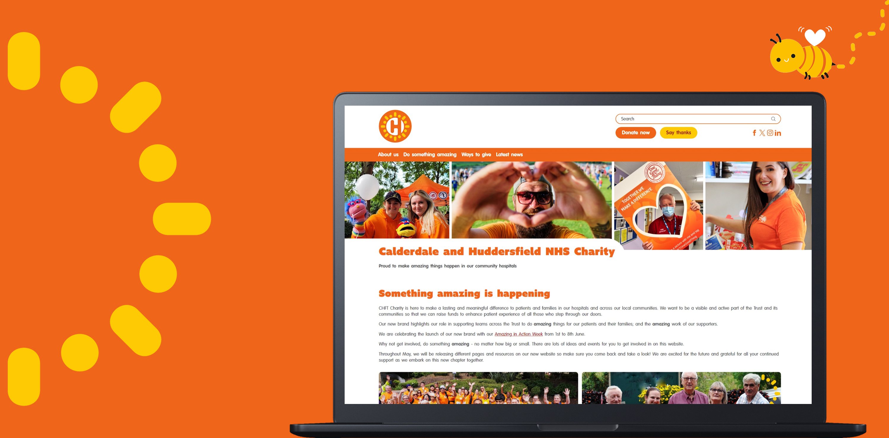
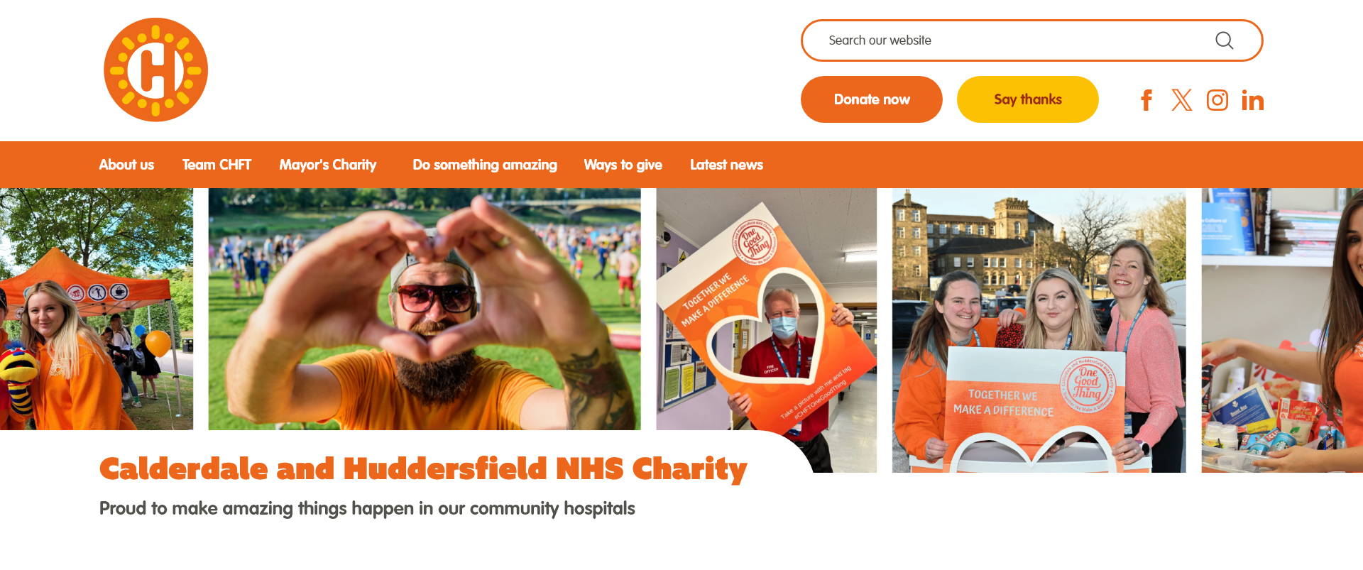
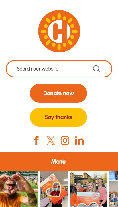
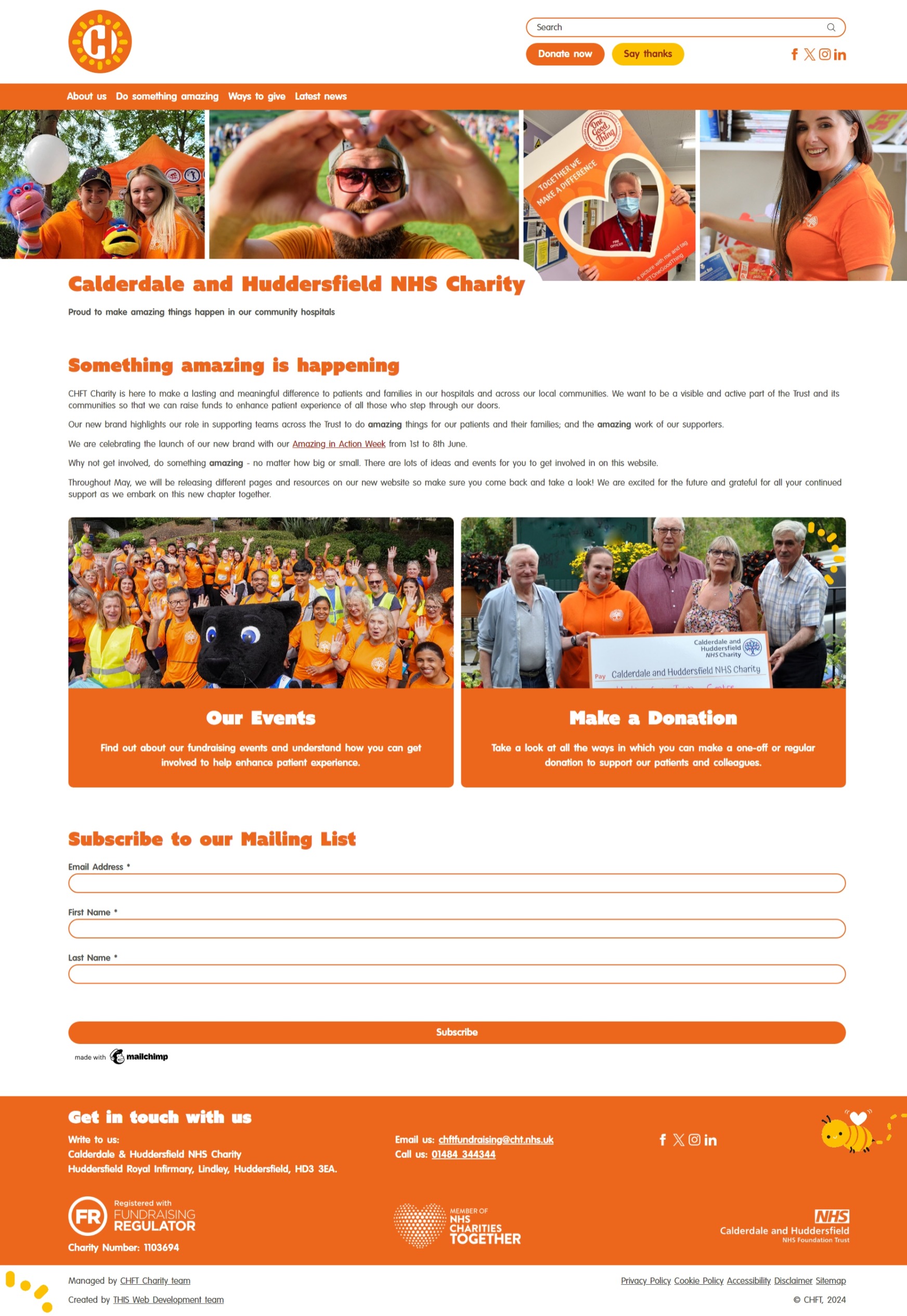
After meeting with the Charity to discuss the new branding and their vision for the website, I began creating visual mockups in Adobe XD. I focused on the header, as this is typically what users first see when they visit a website. Each design featured rounded corners to align with the friendly feel of their brand. I presented the Charity with the 6 options, and they chose to move forward with mockup 3.
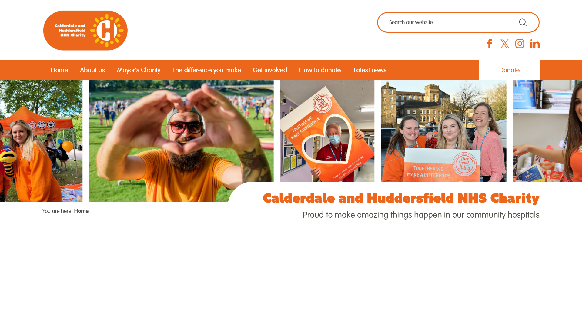
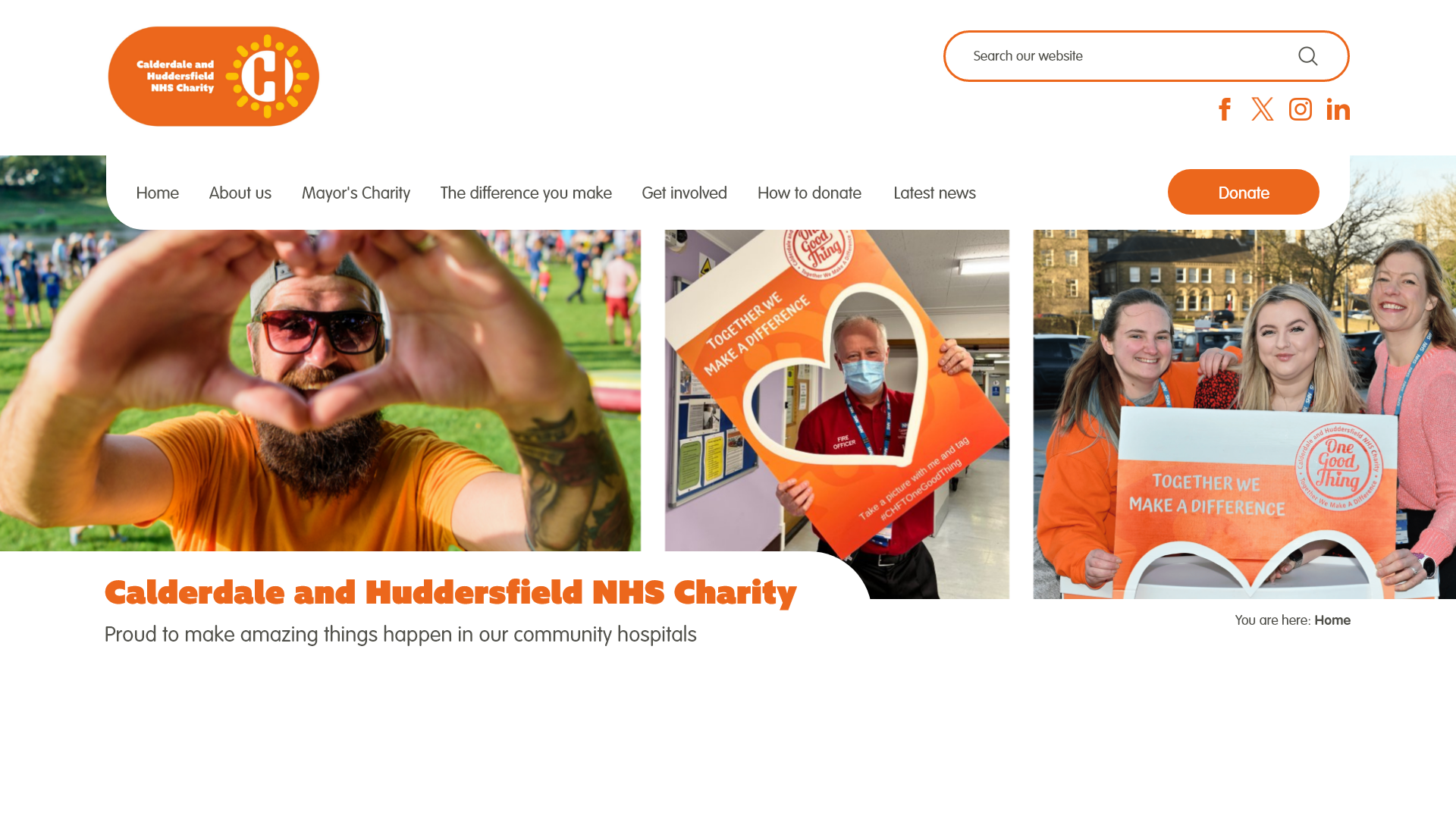
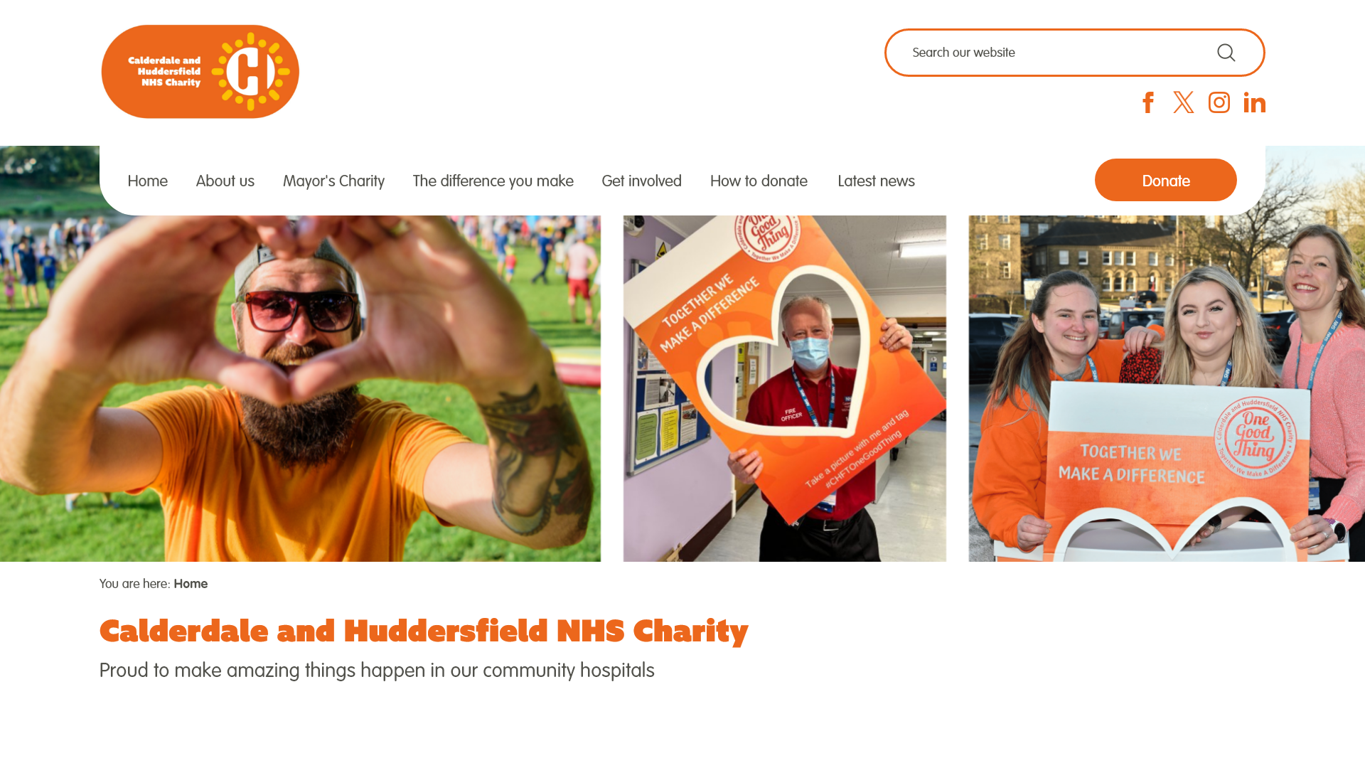
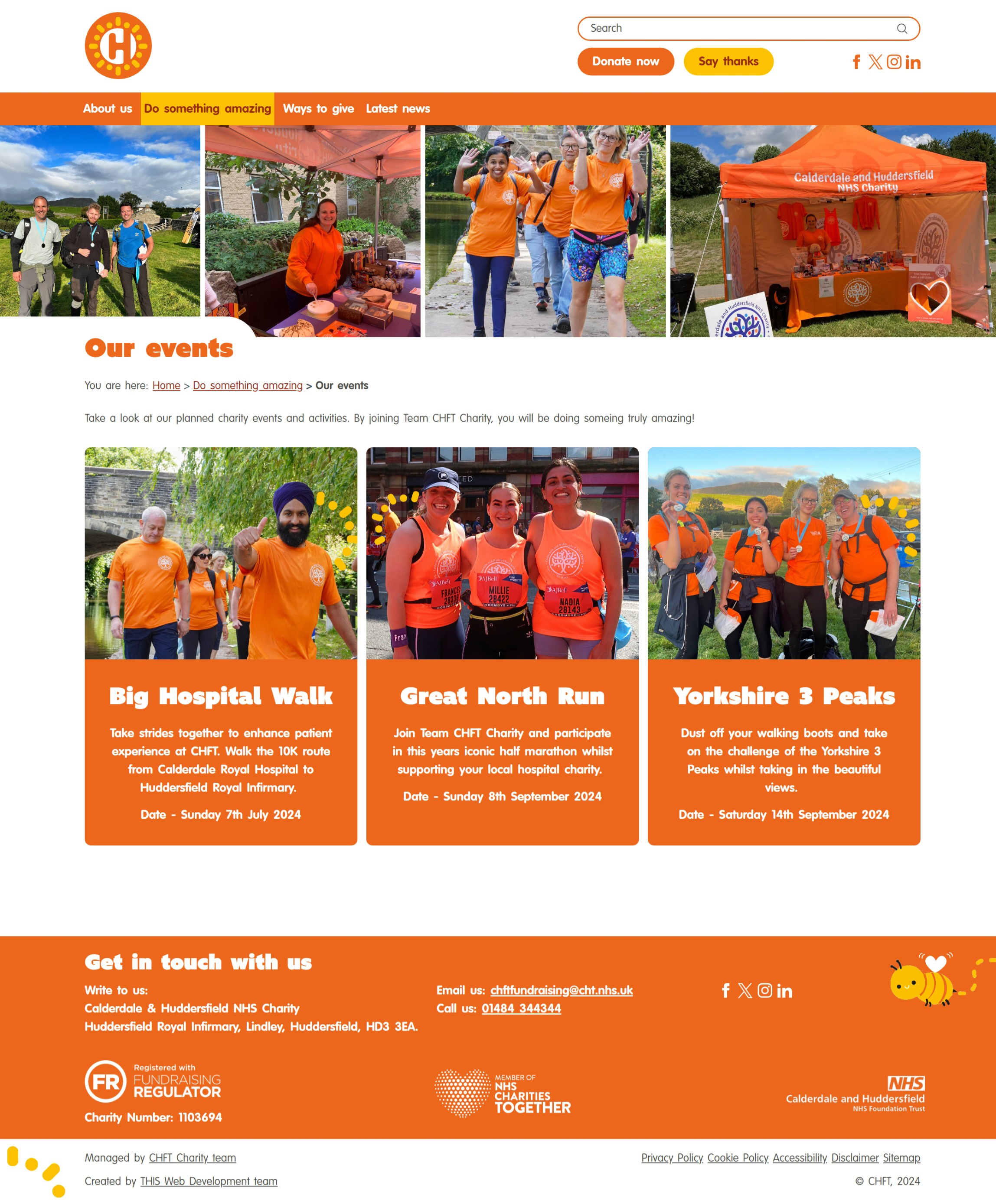
Upon choosing the desired header design, the Charity team requested that a 'Say thanks' form page be added to the website, linked through a button within the header area. They also requested that the 'Donate now' button to be more prominent and that both buttons be placed next to each other.
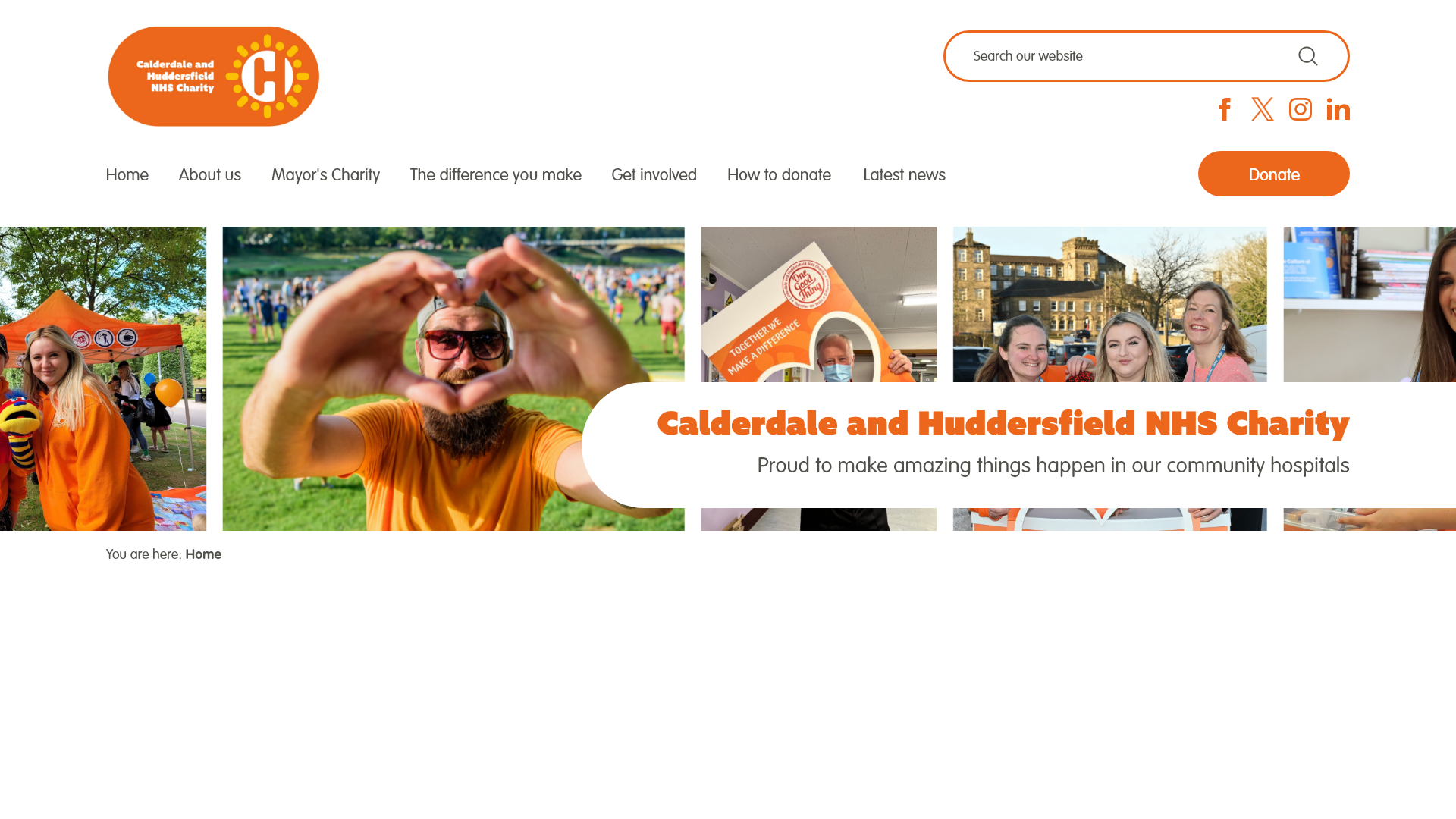
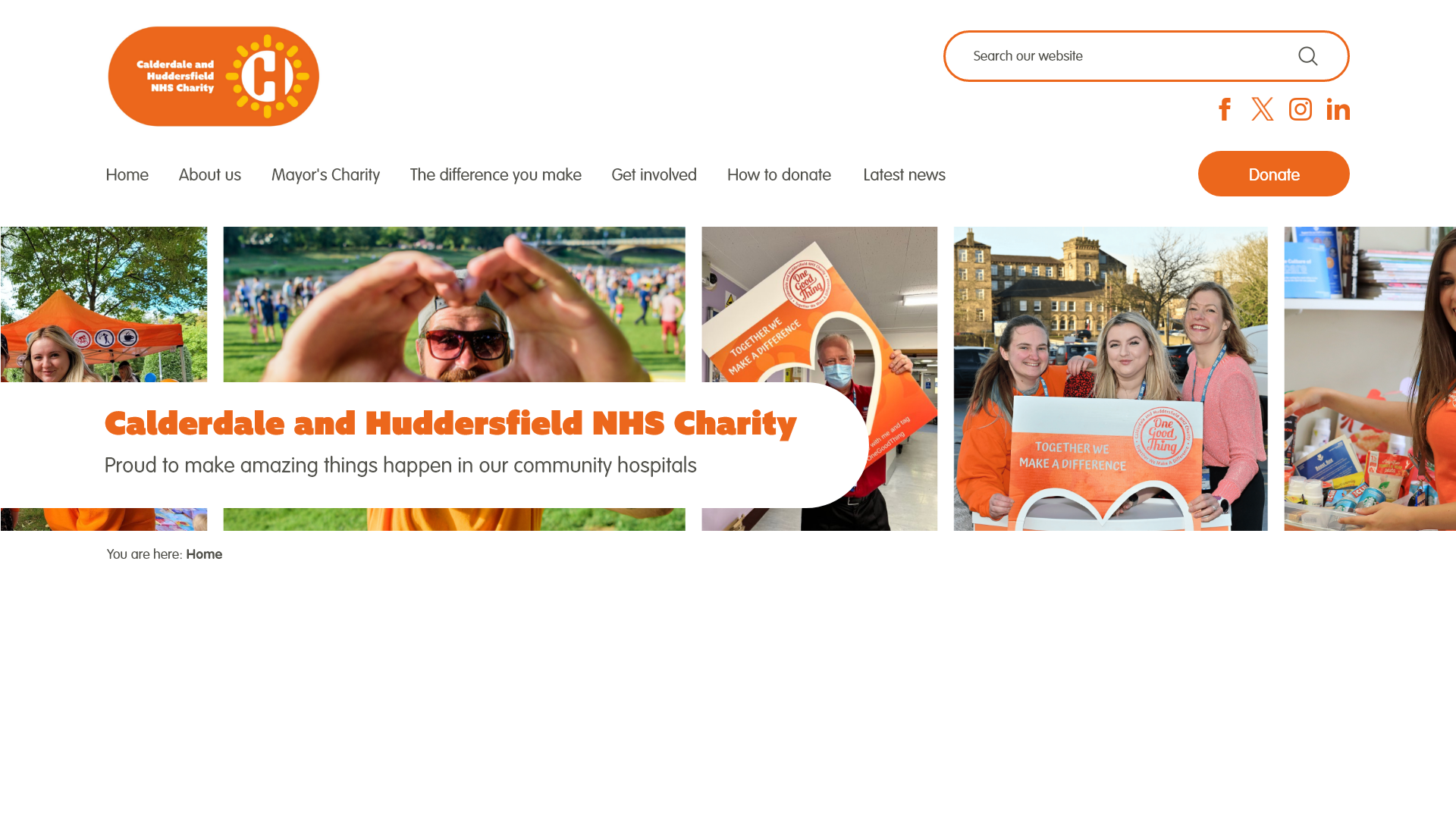
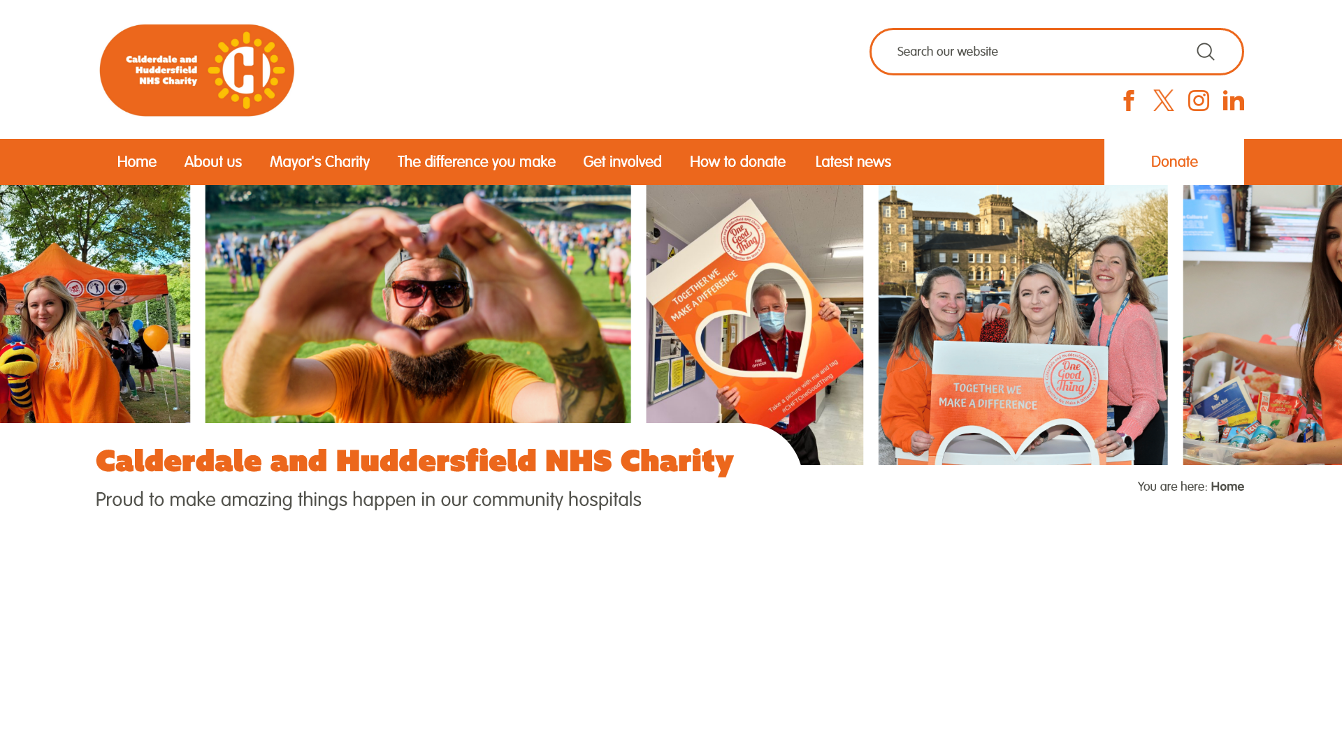
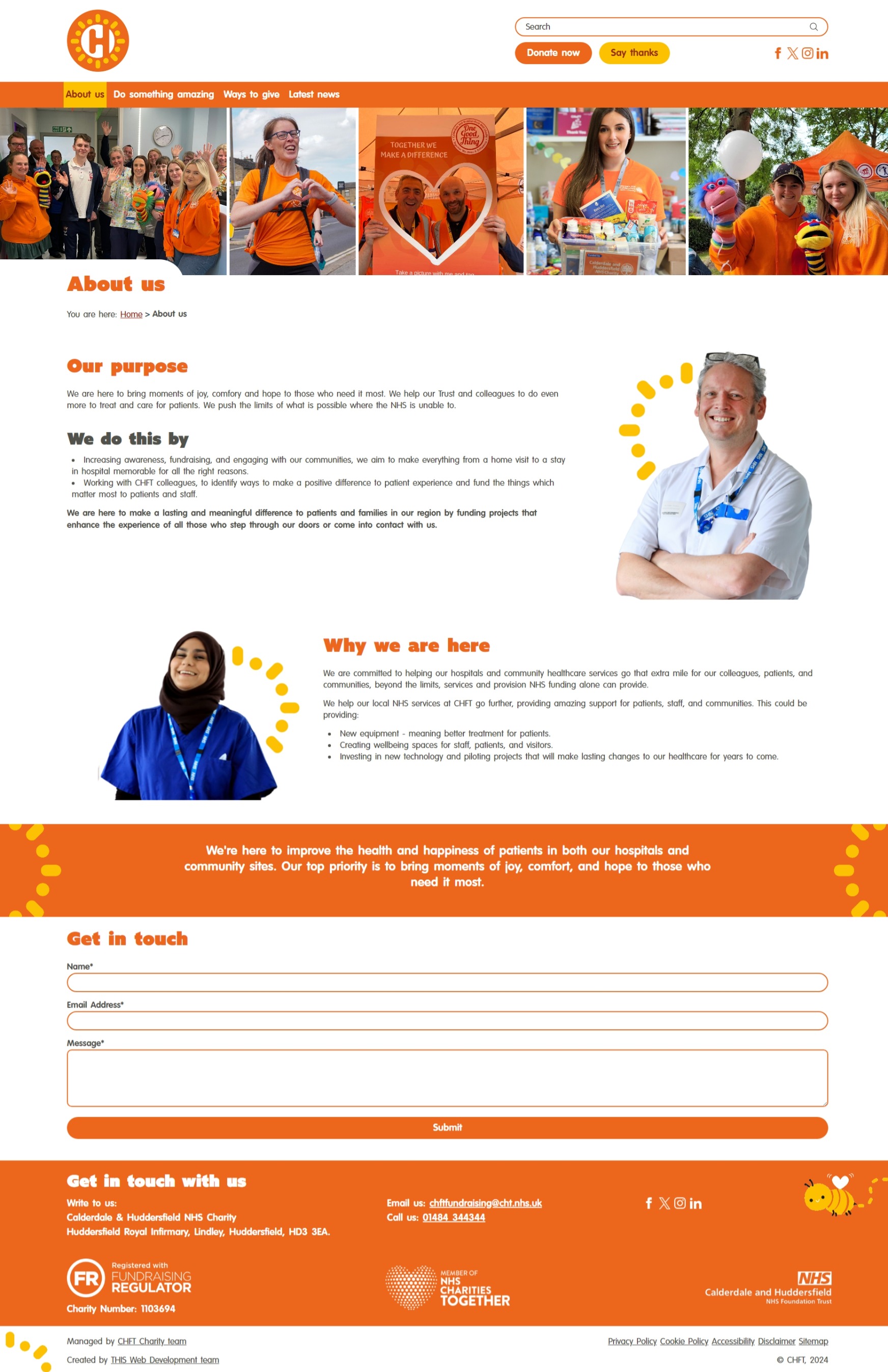
During this conversation, I asked whether the full logo was necessary and suggested using the simplified logo mark instead, as the "Calderdale and Huddersfield NHS Charity" wording was small and might be difficult to read for those with poor eyesight. Since the wording also appeared elsewhere on the website, the Charity team agreed, and the simplified logo mark was used going forward.
The buttons were placed under the search box with primary and secondary button styling, making them more prominent on the page. With the 'Donate now' button moved, the navigation bar felt cleaner and less cluttered. The Charity team were pleased with these changes.
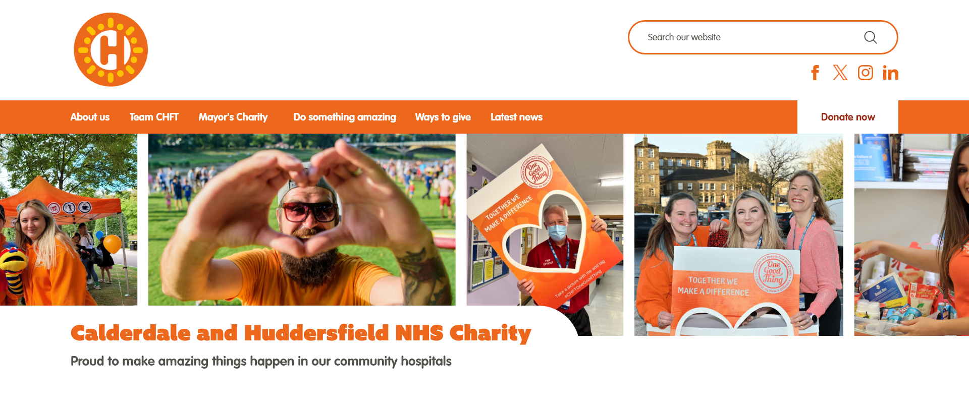
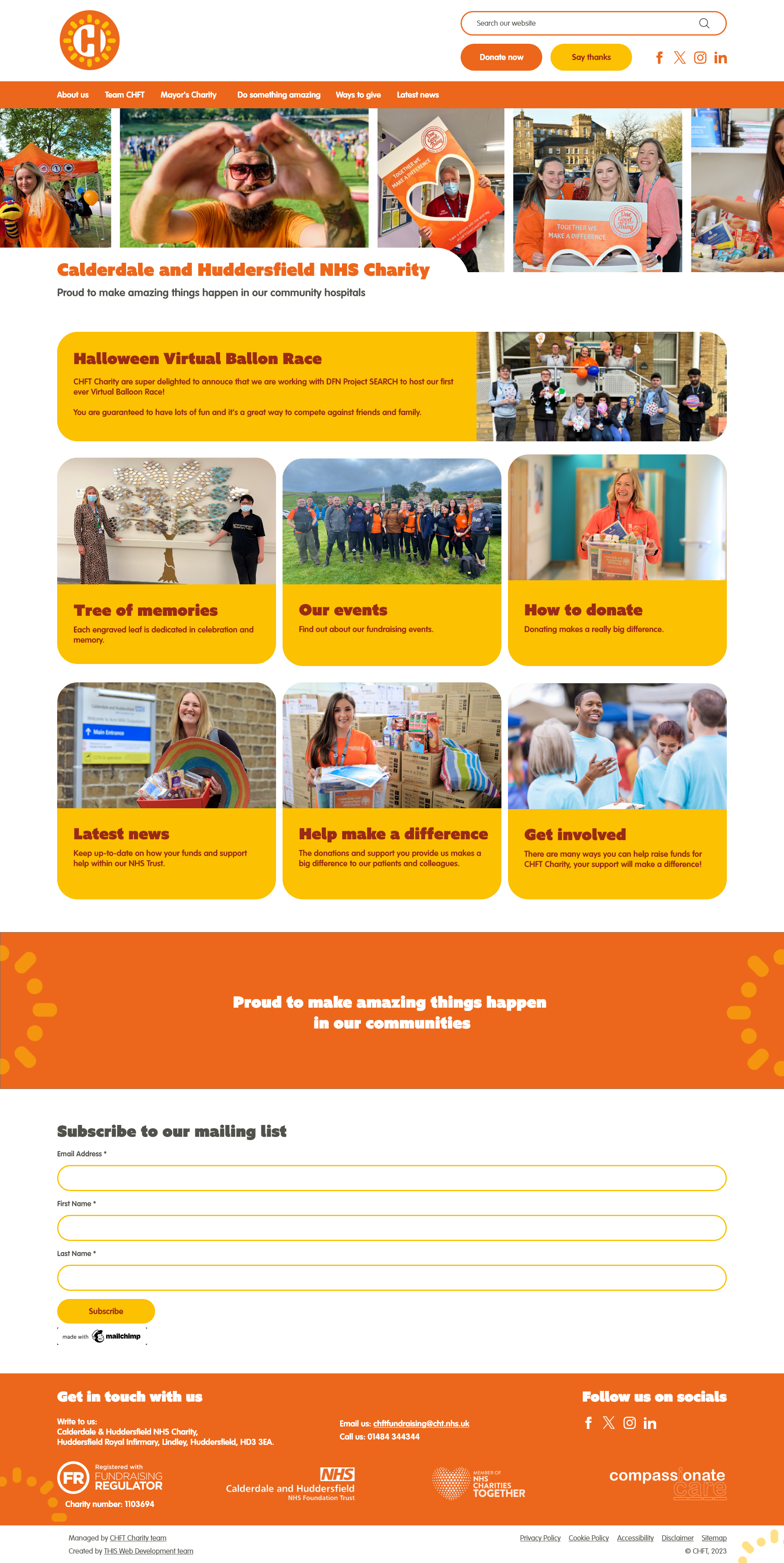
The homepage was then designed to show how other elements within the website would look with their new branding implemented. Initially, the elements within the main content area were going to be their secondary colour, yellow. However, after seeing this visually, the Charity decided that using orange as the full primary colour for all elements was a better fit.
With the design direction approved, I developed a TYPO3 sitepackage that provided the Charity with the flexibility to easily edit the content themselves. This was initially developed locally using Docker and DDEV. GitHub is used to store the sitepackage code base, enabling version control and easy deployment to the server. The SQL database is managed through PHPMyAdmin.
The sitepackage itself is configured primarily using TypoScript, TsConfig and HTML. CSS and JavaScript are included to provide styling and additional functionality. The Fluid Template Engine is used throughout, enabling the use of dynamic content created in TYPO3 itself. Inside the Partials and Template files, the following Fluid tags were used:
<f:cobject />- Render TypoScript objects, with attributes passed to specifically target pages and column positions.<f:image />- - Renders images.<f:if />- Renders content based on a condition.<f:then>renders content if the statement is true, and<f:else>renders content if the statement is false.<f:render />- Renders partial templates or sections.
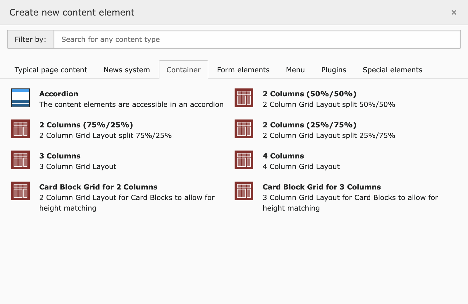
Using TYPO3's Container Elements, I coded custom containers to give the Charity customisable layout options for each page. Content Defender was used to enabled additional functionality to the containers as well as the core backend layout, allowing the ability to set maxItems and to define allowed and disallowed elements. Once defined, these options can be selected inside TYPO3 backend as shown in the screenshot below.
Third-party TYPO3 extensions were utilised to provide additional functionality such as search and news. To customise these to match the design, the extension files were amended through the sitepackage. This was achieved using the @import feature to include TypoScript files containing specific configurations. Root paths were set to define the locations of the HTML files that override the default views.
In addition to this, TsConfig was coded to define the website layouts, headers, frames, and available content elements.
Further flexibility in styling the content elements was provided through the use of Frames and RTE (Rich Text Editor) Styles.
I created a custom Default.yaml file within the RTE directory of the sitepackage. This file was defined in the PageTS and included additional styled elements that the Charity could select within TYPO3. CSS was then used to target these classes, giving the elements the desired styling.
Custom Frames were created to wrap a specified tag around the content element to which they are applied, enabling targeted styling using CSS and JavaScript. In this particular case, I provided the Charity with two Frames. These Frames were configured in the Frames.typoscript file, and their labels were set within the TCEFORM.tsconfig file.
One of my favourite aspects of the project was using CSS and jQuery to make their Digital Bee Mascot fly into view.
This feature was a late addition to the website, implemented just a week before the launch date. I discussed with the client the best approach to include it without overpowering or clashing with the existing content. Based on my recommendation, we agreed that the footer was the most suitable placement. With this addition, other elements within the footer needed to be rearranged. To ensure the client was satisfied with the layout, I designed a mockup in Adobe XD to show these changes before coding them into the site.

With one of the requirements from the Charity being the inclusion of movement, I felt that this particular element lent itself perfectly to animate into view. I implemented this using jQuery, which detects when the element enters the viewport and then applies the CSS classes to trigger the transitions. CSS Transitions were utilised to ensure smooth movement on the screen. To optimise performance, I added a line of code to stop observing elements once the CSS class has been applied. This transition effect was extended to the Ray's graphics, adding further movement to the pages and fulfilling the initial requirements of the website build.
Incorporating the new branding into their website, built on the TYPO3 Content Management System, enables the Charity to promote and share the amazing work they are doing within the Calderdale and Huddersfield hospital sites, as well as within the surrounding communities.
🗣️ Testimonial from Emma Kovaleski, Charity Manager:
"Sophie, you are absolutely an integral part of the CHFT Charity team and a pleasure to work alongside! Thank you for all your time and investment in helping the charity of CHFT and our Emily to be the most AMAZING web version of themselves."