SHOUT Associates
~ Branding • Design • Website Design • Prototyping ~
SHOUT Associates is a new web startup with the basis of the company being around building a fully agile community of creatives, crafted into the perfect team ready to take on client brief.
I developed a brand identity they could use across various platforms alongside a website prototype in Adobe XD, enabling them to begin connecting with creatives to build a portfolio of associates as well as advertising themselves to potential customers.
Using the competitor analysis, I brainstormed company name ideas, checked their availability through Company House and asked my peers for their opinion on which name would be best for this type of business. A poll was created on Facebook Messenger for ease and showed the two popular names were SHOUT associates and Only Collective with SHOUT associates being the most voted.
Following the creation of various moodboards, I experimented with different designs by sketching my ideas out. Using Abobe Illustrator, I created some quick concepts to see which style would work best.
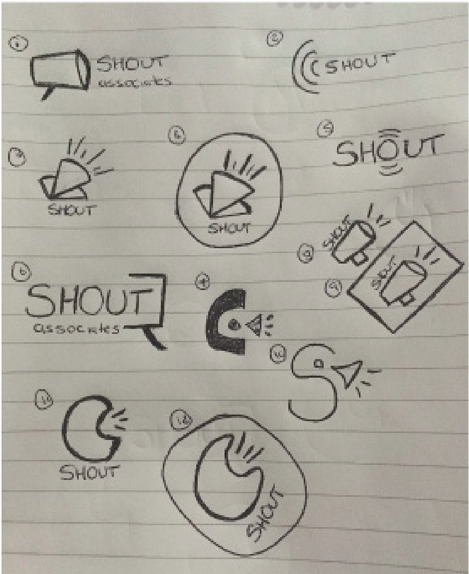
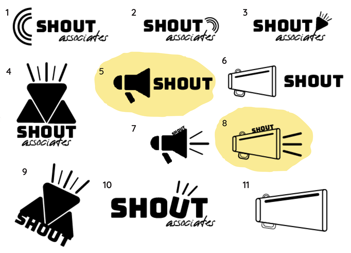
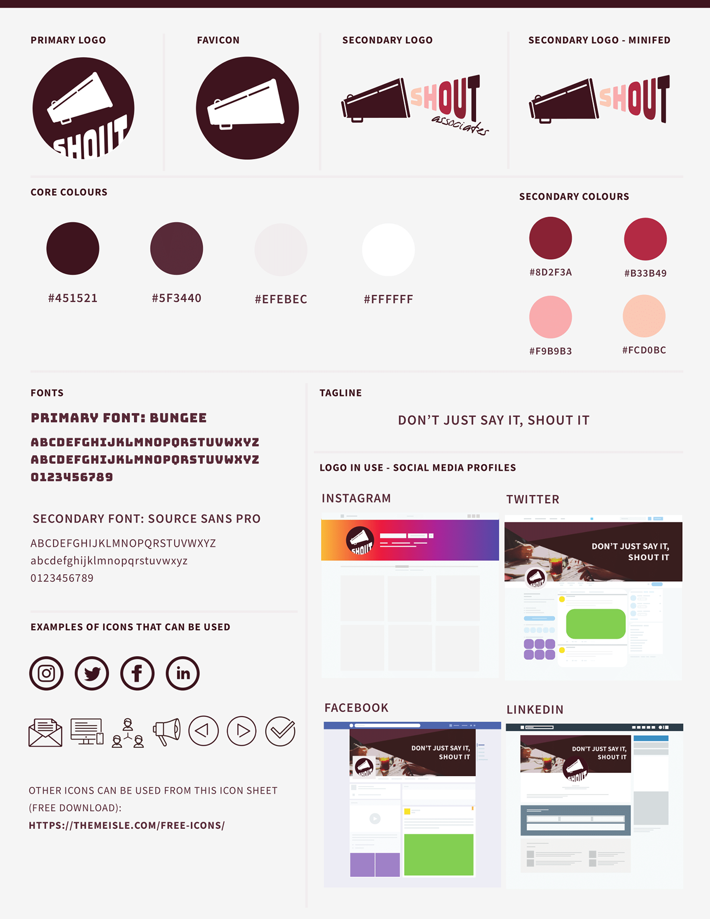
With a company name like SHOUT, the colours of the brand needed to be bold to align with the brand mark which incorporates a megaphone.
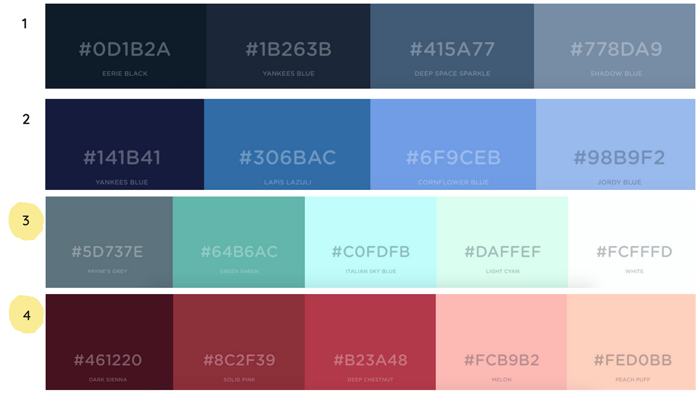
I tested the colour palette that were best received from the 4 options I presented which were colour palettes 3 and 4.
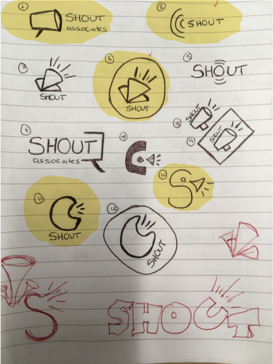
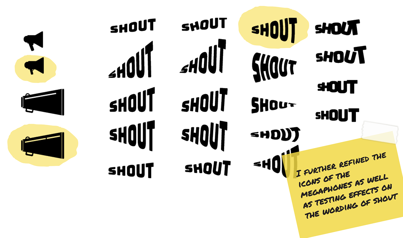
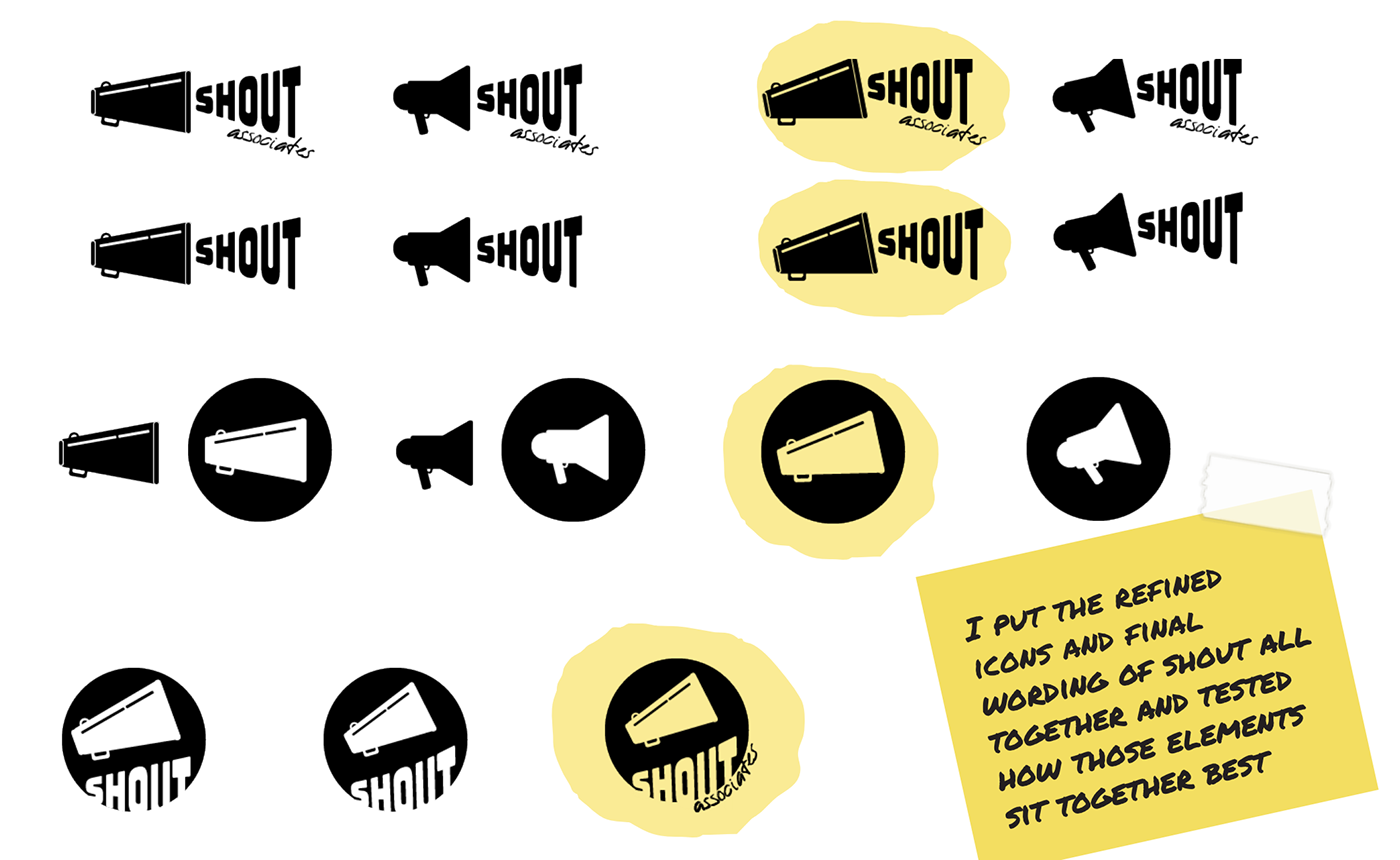
I further refined the logo by improving the icon of the megaphone and experimenting with how the word SHOUT looked style wise. I put the refined icons and final typography for SHOUT together to test how those elements work with each other.
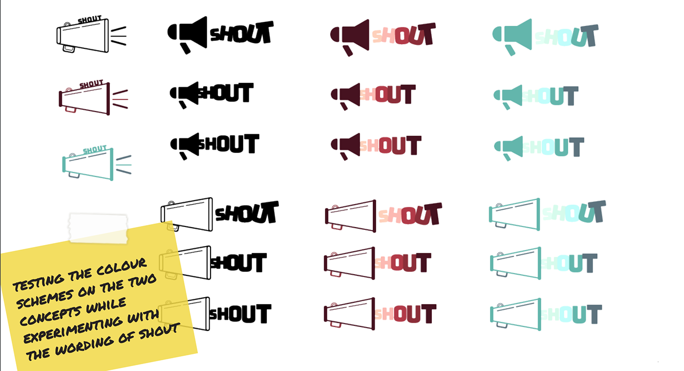
After testing the 2 colour palettes, the deep red colours matched the overall brand with it having a darker tone which suited the word SHOUT well. These colours were much more accessible too.
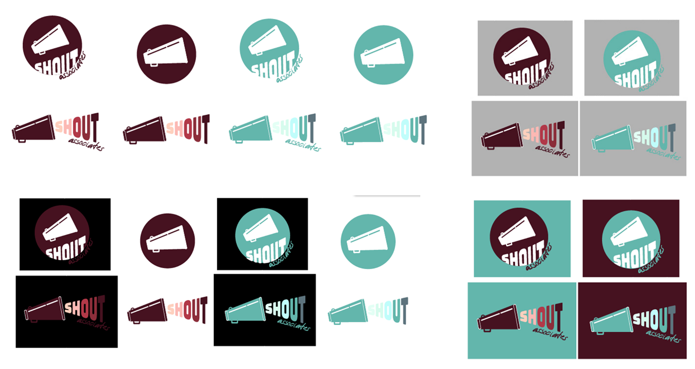
The final result of the branding was a versatile logo mark which through the use of the megaphone icon provided consistency no matter which variant was used.
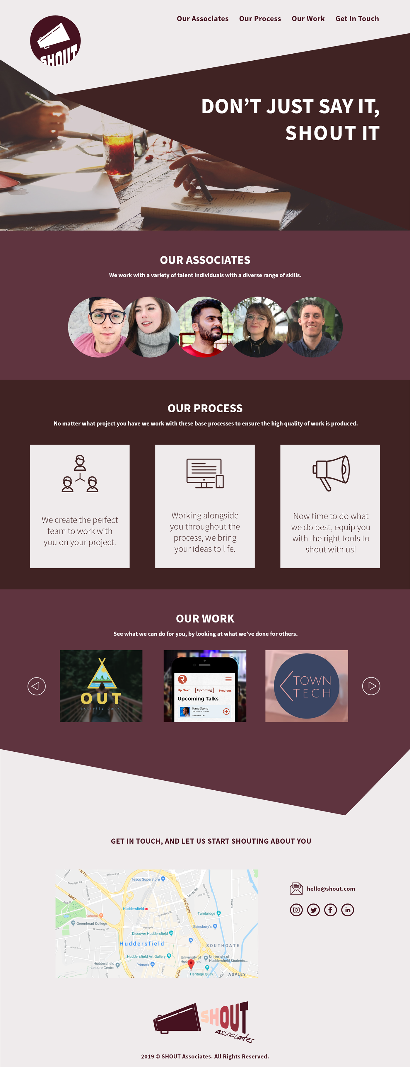
The final stage of this project was to design a website for SHOUT that reflects the overall brand to promote their services. I sketched out layouts for the website to see quickly which would work best with the overall brand direction. Using these, I designed the website and created a prototype using Adobe XD.
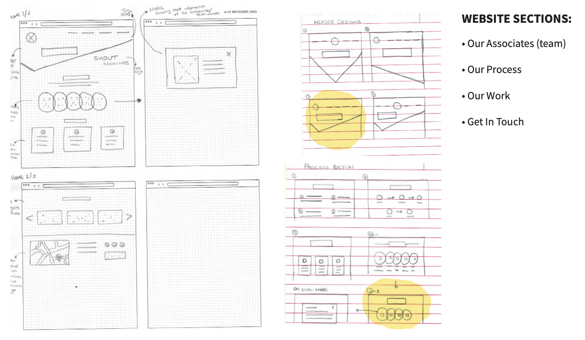
Grid systems are a way of structuring elements on a page. These provide designers with guides that contain a series of horizontal and vertical lines and are used to arrange content. The main advantage of using grid systems is that it provides consistency in the design which creates a good user experience. However, even when using grid systems the rules can be broken to add creativity to the design of the website. There are many grid frameworks on the web, with most providing a 12 column grid.
In this project, a 12 column grid will be used when designing the website as this is the most common, and if the website was coded it can be done with a custom gird or easily with a framework like Bootstrap.
Adobe XD has a built-in feature that allows you to create grids for each artboard which is fully customisable and overlays on top of the content. This was set based upon the Bootstrap grid which is one of the most common CSS frameworks.
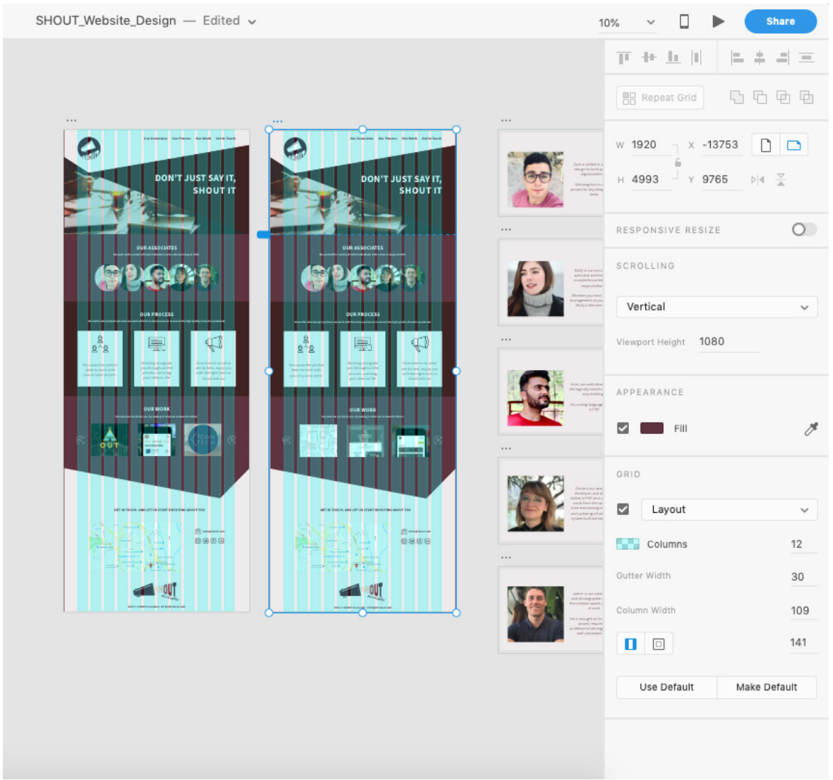
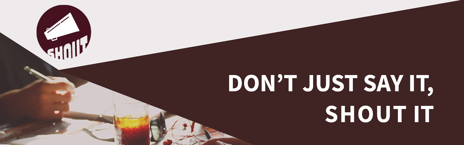
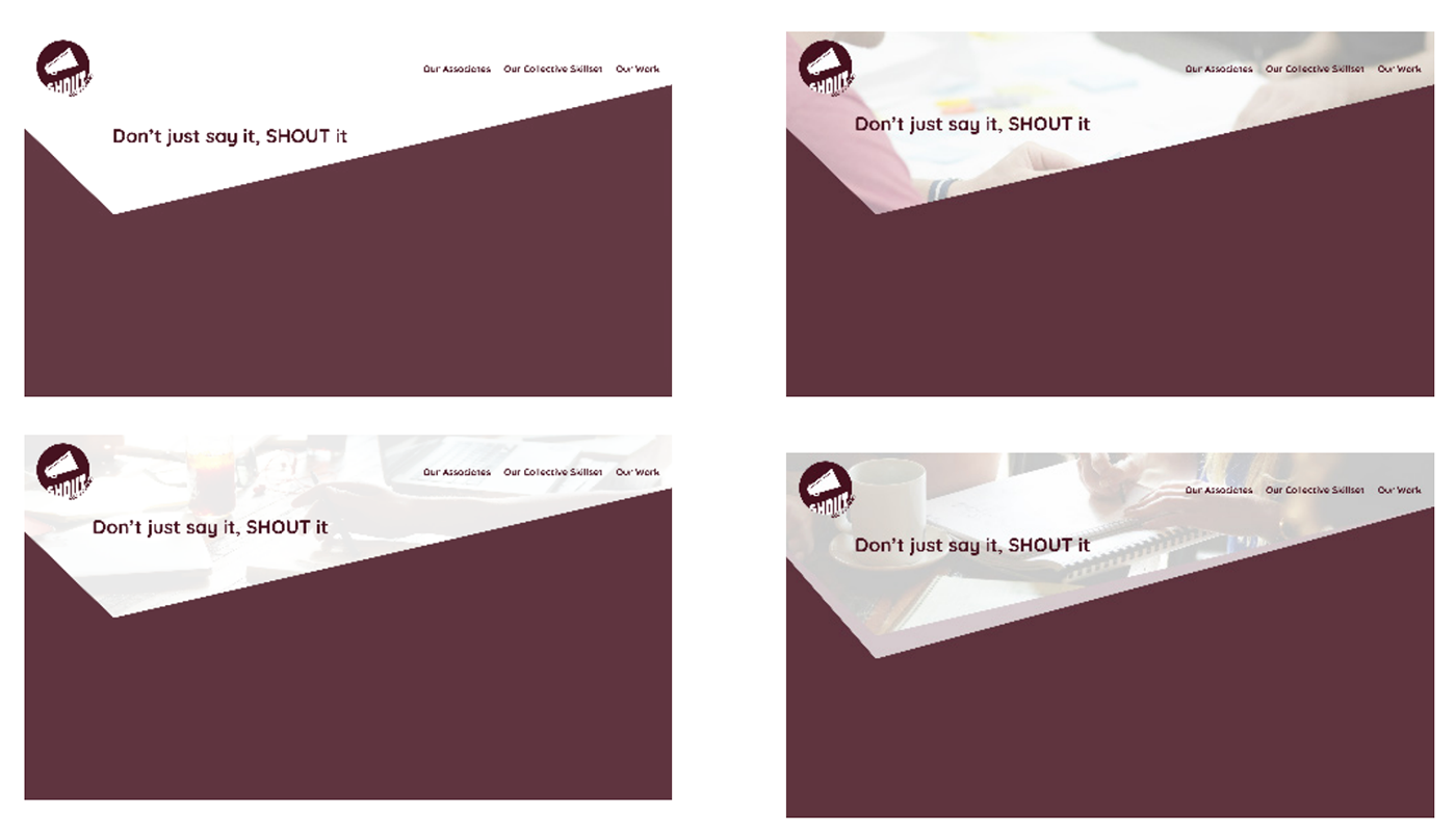
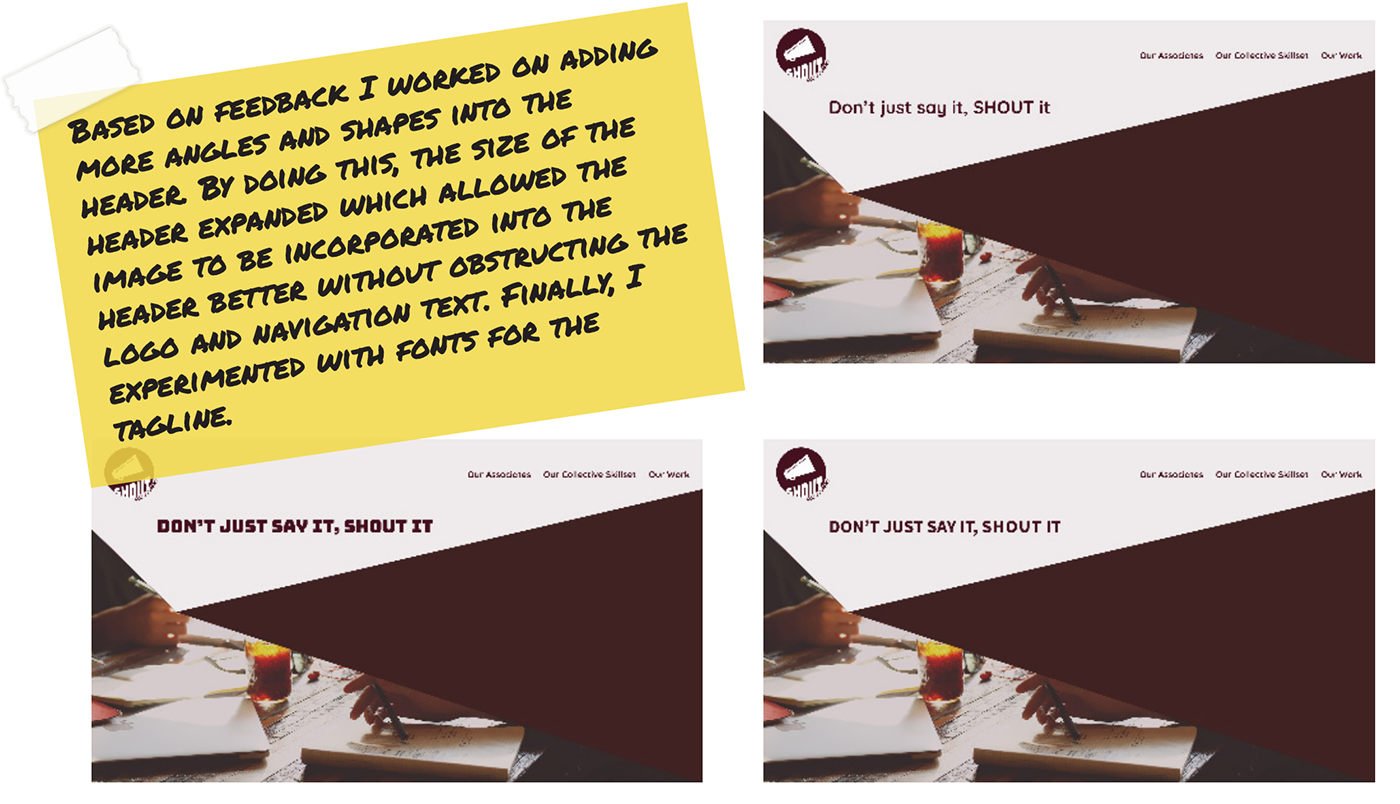
I put a lot of focus on the design of the header area as this will set the impression with it being what someone typically sees first. I experimented with images and colours to see what would work best with the brand identity I designed. Following feedback, I worked on adding more angles and shapes to the header area. This expanded the size of the header which allowed the image to be incorporated into the header without obstructing and effecting the accessibility of the logo and navigation text.
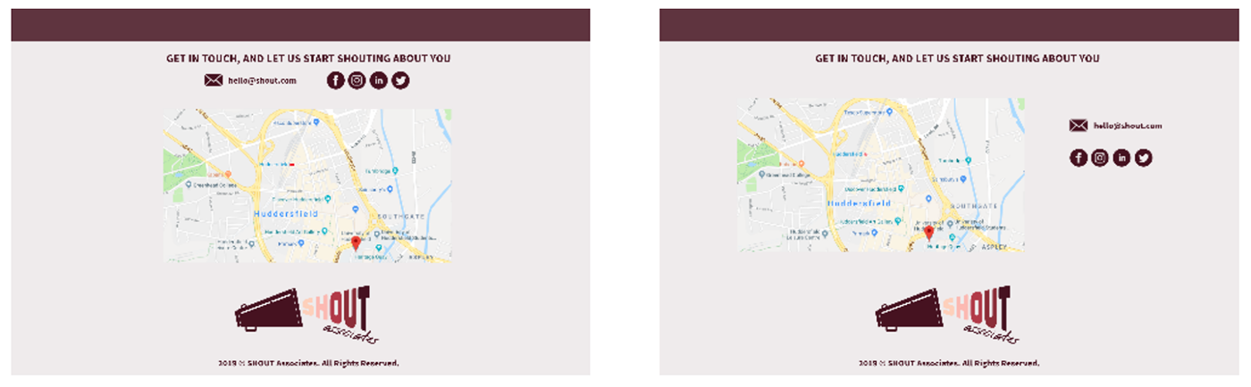
To ensure brand consistency, I then designed the footer area. This was the main call to action providing information of where they were located and how to get in touch. Placing the logo in the footer reenforces the brand identity.
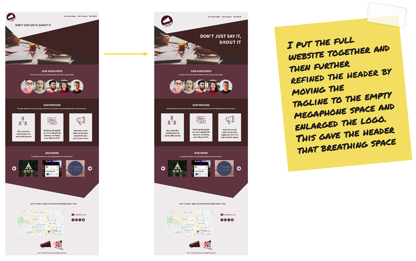
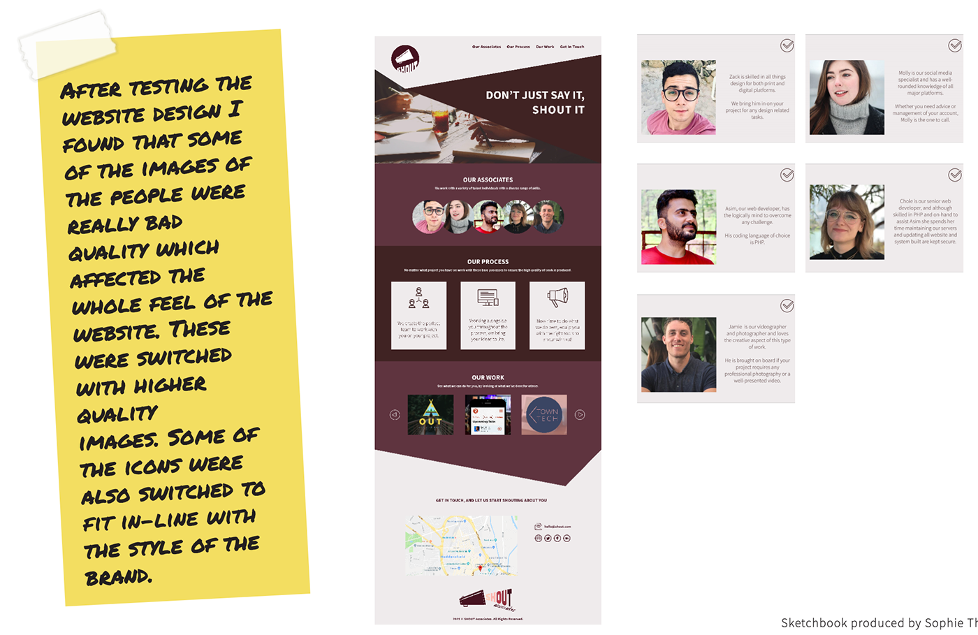
Following this, I designed the rest of the website. I further refined the header by moving the tagline to the empty megaphone styled space and enlarged the logo, giving all the elements more space. I switched out some images for higher quality ones and incorporated icons that fit more in-line with the style of the brand.
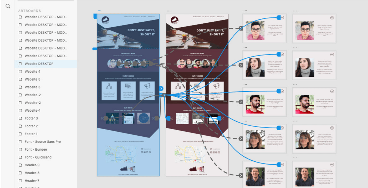
Using Adobe XD, I prototyped the website design to show how you would navigate through the website and the interactions someone would make when browsing.
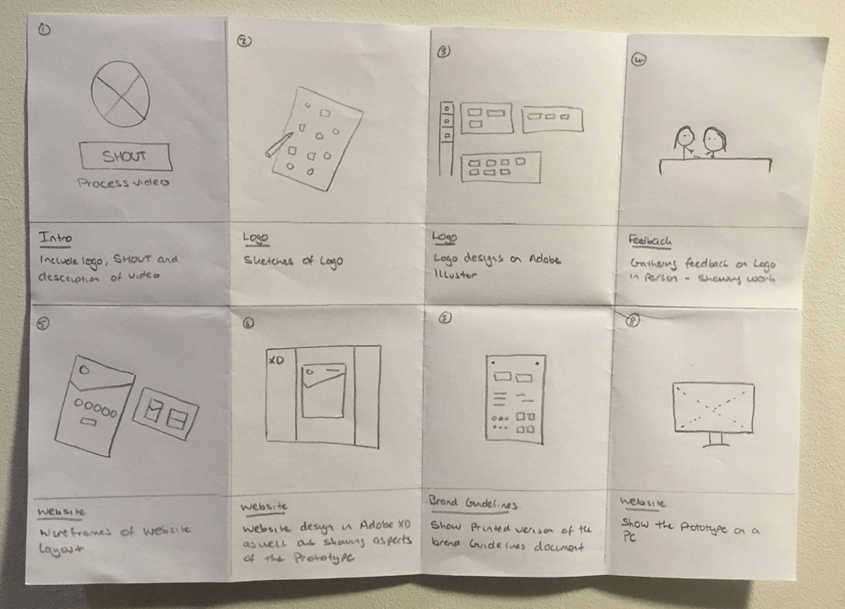
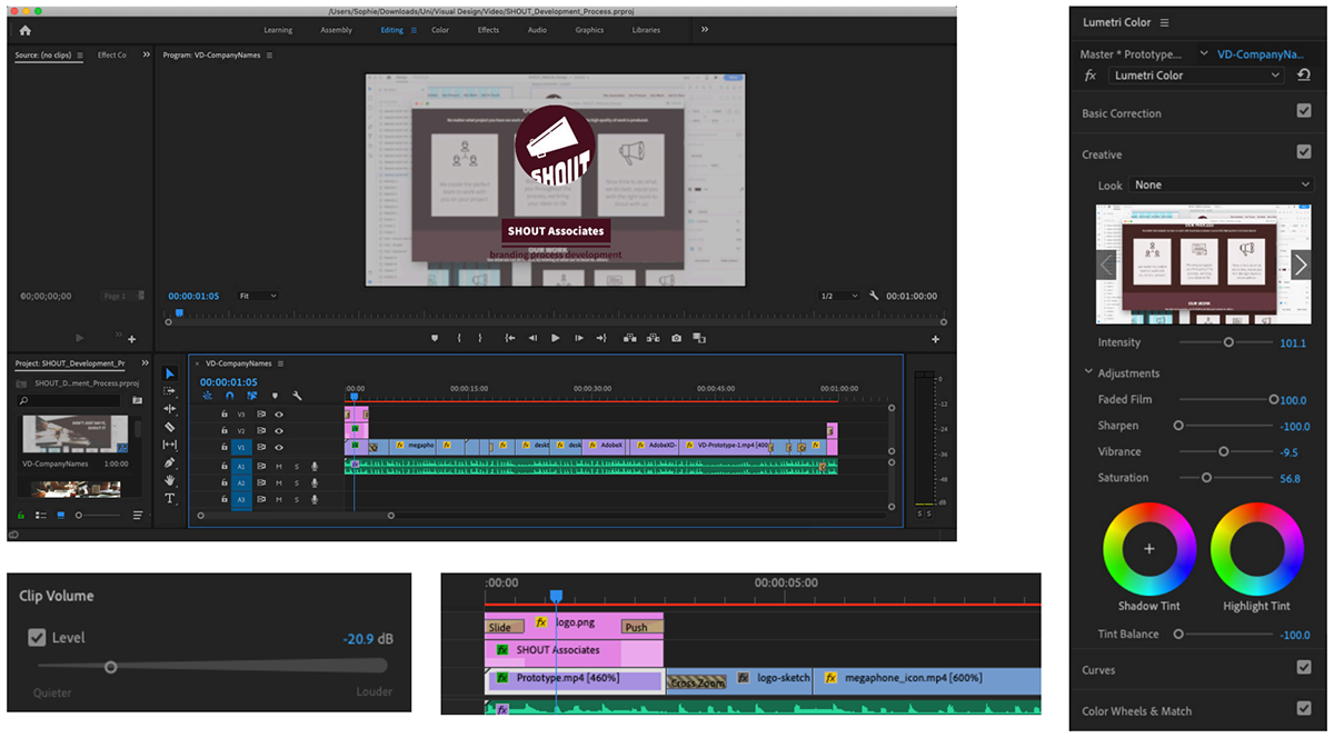
To show the branding and design process of this project, I created a short showcase video. To aid in the process of filming and editing this video together, I created a storyboard to show the key frames of the video and what footage I needed to gather.
After filming the footage using both a camera and screen recorder, I imported them into Adobe Premiere Pro. Using in-built features, I added transitions, increased the speed and adjusted the colour of certain clips as well as tweaking the volume level of the background music.
Watch my showcase video for SHOUT Associates which shows the branding process.